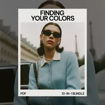
Find Your Best Colors: A Step-by-Step Beginner Toolkit
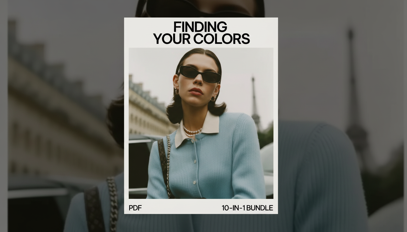
Finding Your Colors, One Clear Step at a Time
Color analysis can feel like a maze: undertones, seasons, contrast, and the classic question—why does that shade look polished on someone else but make you look tired? A beginner-friendly toolkit helps by turning color discovery into a few repeatable tests you can do at home. Instead of chasing a “perfect season” in one sitting, you’ll build a wearable palette in stages: start with temperature, narrow by depth and contrast, then translate results into outfits and smarter shopping decisions.
As you test, keep two things in mind: lighting changes everything, and results work best as a flexible guide—not a rigid rulebook. For a quick refresher on how skin can respond to sun exposure and why your skin’s appearance can shift over time, the American Academy of Dermatology Association is a reliable resource. For a broader look at how color is perceived and categorized, the Pantone Color Institute is also helpful.
What color analysis helps with (and what it doesn’t)
At its best, color analysis is a shortcut to looking more cohesive with less effort. It helps identify colors that harmonize with your undertone, depth, and overall contrast so outfits feel intentional. It also supports faster outfit-building by reducing “almost right” purchases and the closet confusion that comes with owning too many similar-but-not-quite shades.
It can improve consistency across clothing, hair color, accessories, and makeup. But it doesn’t replace personal taste—favorite colors can still work when placed away from the face, softened with neutrals, or shifted to a more flattering version (think muted teal instead of neon turquoise). And it’s not a strict rulebook: lighting, fabric texture, and saturation can change how a color behaves, so treat your results as a flexible palette you can refine.
Common color-analysis terms, simplified
| Term | What it means | Quick clue to look for |
|---|---|---|
| Undertone | Warm vs cool (or neutral) | Gold vs silver jewelry looks more harmonious |
| Value (depth) | Lightness vs darkness | Do very light shades wash out or brighten? |
| Chroma | Muted vs clear/bright | Dusty tones vs crisp jewel tones |
| Contrast | Difference between features | High contrast (hair/eyes/skin) vs low contrast |
| Seasonal palette | Grouped color families | A framework to organize what works best |
Step-by-step: finding your undertone and temperature direction
Start simple and keep the conditions consistent. Stand in natural daylight near a window, turn off strong overhead lighting, and remove heavy makeup for the first pass. If you can, pull hair away from your face so you’re seeing your skin clearly.
Next, run a warm/cool comparison with two fabrics held close to your face (a scarf, T-shirt, or even paper works in a pinch). Try creamy ivory vs bright white, or coral vs true pink. The “better” option typically reduces the look of redness and shadows and makes your skin appear more even. The less flattering option often emphasizes under-eye darkness, dullness, or uneven tone.
Step-by-step: measuring contrast and depth to narrow your palette
Using a 10-in-1 beginner bundle to stay consistent
Turning your palette into outfits, shopping rules, and confidence
What’s inside the Finding Your Colors Step by Step Toolkit
If you want a structured path instead of piecing together scattered tips, the Finding Your Colors Step by Step Toolkit – 10-in-1 Color Analysis for Beginners Bundle is designed to break the process into manageable stages rather than one overwhelming quiz. It includes multiple guides and eBooks that explain core concepts, seasonal direction, and practical wardrobe application, plus checklists for repeatable testing (lighting setup, fabric comparisons, and quick scoring).
Toolkit snapshot
| Feature | How it helps | Best use case |
|---|---|---|
| Step-by-step guides | Reduces guesswork | First-time color analysis learners |
| eBooks | Adds depth and examples | Understanding why certain shades work |
| Checklists | Creates repeatable results | Shopping and closet edits |
| Palette-building framework | Turns results into a usable set | Capsule wardrobes and outfit planning |
Helpful add-ons for follow-through
Confidence grows when your process is consistent, not when it’s perfect. If you’re building new habits around styling and self-presentation, a mindset resource like the Benefits of Positivity Bundle: Fuel Your Mind, Build a Positive Mindset & More can support the “stick with it” part—especially during closet edits or shopping resets.
And if you like keeping your swatches and notes together (fabric scraps, printed palette cards, outfit photos), a simple organizer can help you stay consistent week to week. The Large Capacity Y2K Puppy Pencil Case can work as a compact storage spot for color cards, small accessories, and testing notes.
FAQ
Can color analysis work if undertone seems neutral?
Yes. When undertone reads neutral, focus on depth, contrast, and chroma—those factors often create clearer wins than forcing warm vs cool. Build a palette around your best neutrals first, then add tested accent colors that consistently brighten your face.
How long does it take to find a wearable color palette as a beginner?
Many beginners get a strong starting palette in one focused session, then refine it over a few days of outfit testing. Daylight comparisons, quick photos, and narrowing to 8–12 core colors make the process faster and more reliable.
Do flattering colors mean giving up favorite colors?
No. Favorite colors can still work by moving them away from the face (skirts, pants, shoes), pairing them with your best neutrals, or choosing a more flattering version with adjusted depth or chroma. Accessories are also an easy way to keep beloved shades in your style.


Leave a comment