Color Psychology in Clothing: Mood, Confidence & Signals
Color Perception in Fashion: How Clothing Colors Influence Mindset and Social Signals
Color choices in clothing can subtly shift mood, energy, and the way others interpret presence and intent. The effect isn’t magic and it isn’t one-size-fits-all: it’s a mix of how vision works, what experiences have taught the brain to expect, and what the setting “allows” a color to mean. When you understand the basics—plus the role of lighting, fabric, and culture—you can build a reliable color strategy for everyday dressing, work, and special occasions without falling into rigid rules.
Why color feels personal (and why it still follows patterns)
Color perception blends biology (eyes/brain) with learned associations (memory, culture, experience). Human vision processes wavelengths into color experiences, but interpretation is layered on top—so two people can respond differently to the same shade. Still, broad patterns show up in attention and emotion research, especially around how quickly a color is noticed and what it tends to signal in familiar contexts.
Mindset shifts often come from expectation: wearing a “power color” can change posture, confidence, and behavior. That’s part psychology and part feedback loop—if you feel more decisive, you act more decisively, and people respond accordingly. For a primer on perception mechanisms, sources like Britannica’s overview of color perception and vision basics from the National Institutes of Health (NIH) are helpful starting points.
The three layers of color impact: self, observer, environment
1) Self-perception
Color can affect arousal level (calm vs. energized) and self-concept (bold, soft, creative, serious). A warm, saturated top may feel “go-time,” while a muted palette can feel steady and grounded. The key is noticing what your body does—breathing pace, tension, voice—when you put a color on.
2) Observer perception
Color influences first impressions like approachability, competence, dominance, and warmth. These signals are not fixed truths, but they are common social shortcuts. If you want a deeper look at color and psychological functioning, the American Psychological Association (APA) site is a credible hub for related research and explanations.
3) Environment
Lighting temperature, background colors, and venue (office vs. outdoors) change how the same garment reads. A blazer that looks rich and calm in daylight can look flat under warm indoor bulbs, and a bright hue can become overwhelming against a high-contrast background.
A practical color-to-mindset map (use as a starting point)
Use these as “first guesses,” not commandments. Styling details—shade, texture, and how much of the color you wear—often matter more than the color family itself.
| Color family | Typical mindset effect | Common social signal | Best used when | Watch-outs |
|---|---|---|---|---|
| Red (true red, cherry) | High energy, urgency | Boldness, intensity | Presentations, statement moments | Can feel aggressive if paired with sharp contrast and rigid silhouettes |
| Blue (navy, cobalt) | Calm focus | Trust, competence | Interviews, meetings, daily wear | Very dark navy can read distant if everything else is muted |
| Green (sage, emerald) | Balance, renewal | Stability, approachability | Networking, casual-professional | Bright greens can dominate photos under cool lighting |
| Yellow (butter, marigold) | Optimism, lift | Friendliness, creativity | Social events, casual settings | Can wash out some complexions in harsh light; consider texture and layering |
| Black/white/gray | Control, clarity | Authority (black), freshness (white) | Formal events, minimalist looks | All-black can feel severe; all-white can read high-maintenance in some contexts |
Shade, saturation, and contrast: the hidden drivers of “vibe”
Shade (light vs. dark) often matters more than the color name. Pastel blue reads airy and gentle; navy reads composed and formal. Saturation (muted vs. vivid) controls intensity: muted tones feel easier and more “everyday,” while bright, clean color looks expressive and high-impact.
Contrast changes perceived sharpness and confidence. High contrast (black and white, bright top with dark pants) tends to look decisive and graphic; low contrast (similar values, soft transitions) tends to look calm and understated. If a color feels “too loud,” you don’t always need to abandon it—try lowering saturation, lowering contrast, or shrinking the colored area to a single piece.
Fabric, finish, and pattern change the message
Context rules: culture, occasion, and lighting
Simple systems for building a color wardrobe that works
Digital guides for a deeper framework and ready-to-use palettes
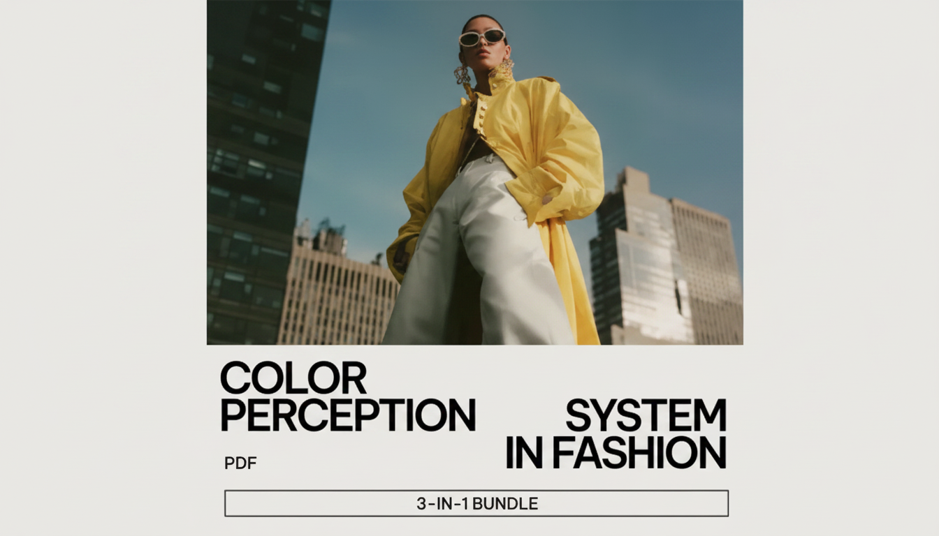
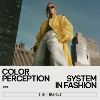
A structured approach makes it easier to translate theory into outfits for work, social settings, photos, and personal confidence—especially when you want repeatable results rather than random trial and error. For a deeper, organized framework, explore the Color Perception System in Fashion – 3-in-1 Bundle, which focuses on mindset effects, how color shapes perception, and practical application.
If your goal is to pair color strategy with more consistent optimism and resilience—so your clothing choices support the mood you’re building day to day—the Benefits of Positivity Bundle complements a color-forward wardrobe by reinforcing the internal side of confidence.
FAQ
Does wearing certain colors actually change mood, or is it just placebo?
Color can influence arousal and attention through associations and context, and clothing adds an “embodied” layer where what you wear affects how you carry yourself. Even when expectation plays a role, the behavioral shift can be real, and results vary by person, setting, and lighting.
What color should be worn to look more confident without seeming intimidating?
Mid-to-deep blues, muted reds (like berry), and emerald or forest greens tend to read confident while staying approachable. Keep the effect balanced with softer textures and medium contrast, such as a confident-color top with neutral pants and understated accessories.
How can color choices look consistent across photos and real life?
Test outfits in window light and the indoor lighting you’ll actually be in, because warm bulbs and cool LEDs can change undertones dramatically. For more predictable results, limit highly reflective fabrics, and consider how background colors and camera white balance can push a shade warmer or cooler.


Leave a comment