Summer Color Analysis Bundle: 5 Cool, Soft Style Guides
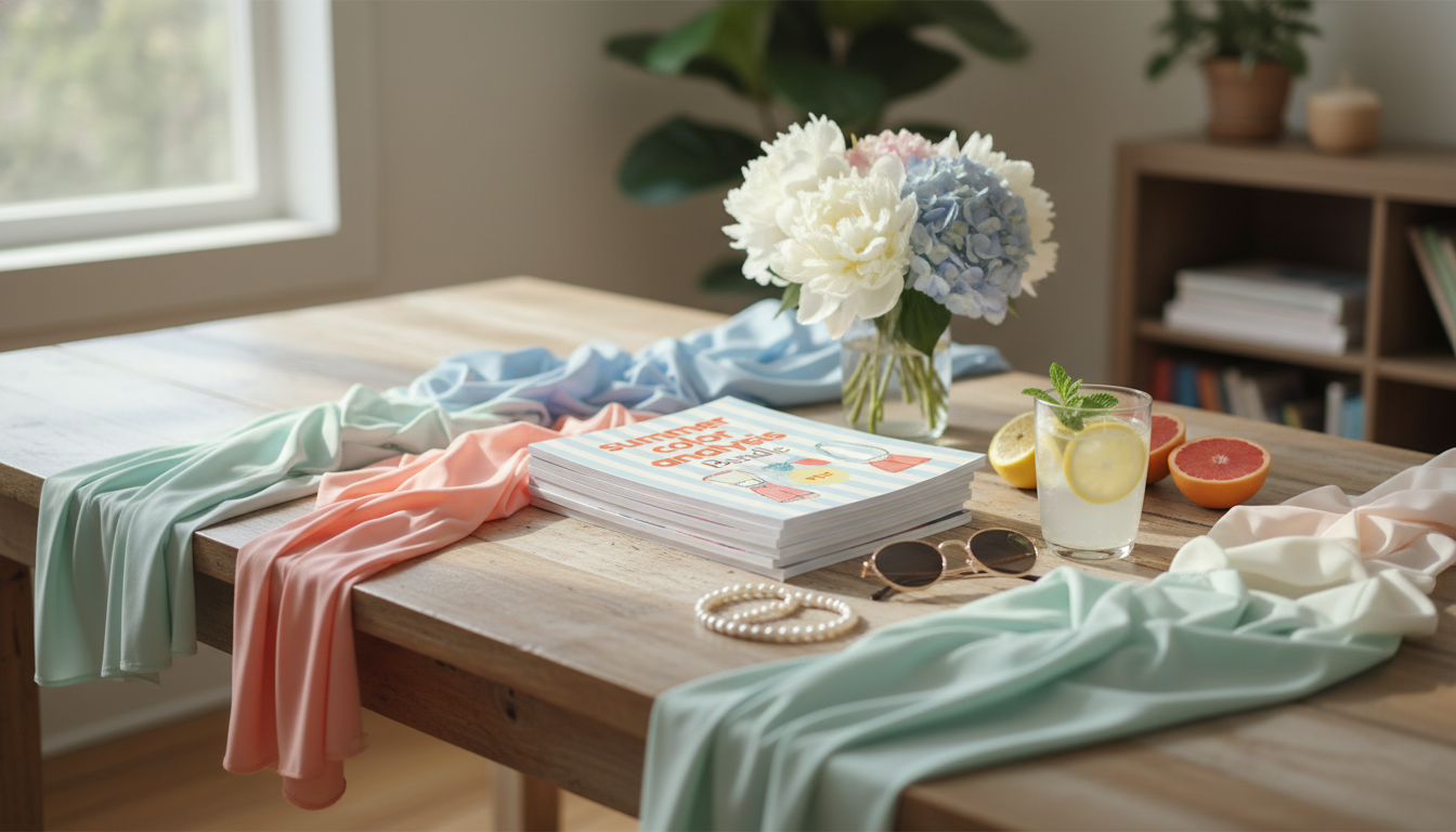
Summer Color Analysis Bundle: 5 Guides for a Softer, Cooler Palette
A Summer palette is known for cool undertones, gentle contrast, and muted-to-soft color intensity. This bundle groups five focused guides designed to help build a cohesive wardrobe and beauty routine that harmonizes with Summer coloring—so outfits look calmer, skin looks clearer, and styling choices feel more consistent across seasons and occasions.
What “Summer” coloring looks like in practice
Summer coloring typically reads cool-leaning, soft, and blended rather than sharp or high-contrast. Many Summers notice that very warm shades (especially orange-based tones) look “louder” than intended, while slightly muted cool colors make the face look smoother and more even.
- Overall impression: cool-leaning, soft, and blended rather than sharp or high-contrast.
- Common traits: ashy or cool hair tones, pink/neutral-cool skin undertones, and eyes that appear greyed, soft blue/green, or cool brown.
- Best results: cool and slightly muted shades; avoid extremes (neon-bright or very warm/orange-based colors).
- Contrast level: low-to-medium; tonal outfits (similar depth) often feel effortless.
- Lighting note: indoor warm bulbs can skew perception—check colors in daylight when possible.
Quick color decisions for many Summer palettes
| If a color feels like… | Often works better as… | Common swap examples |
|---|---|---|
| Too warm or orangey | Cool-leaning alternative | Coral → dusty rose; camel → mushroom taupe; orange-red → raspberry |
| Too bright or neon | Softer, greyed version | Lime → sage; cobalt → denim; fuchsia → mauve |
| Too harsh or high-contrast | Gentler contrast pairings | Jet black + white → charcoal + soft white; stark navy + white → slate + pearl |
| Too yellow-based | Blue-based or neutral-cool | Mustard → cool olive; warm beige → greige; gold shimmer → icy champagne |
For deeper color accuracy and naming consistency across brands, it can help to compare shades using established systems like the Pantone Color Institute and foundational concepts from CIE colorimetry.
What’s inside the 5-in-1 Summer Color Analysis Bundle
The Summer Color Analysis Bundle | 5-in-1 Summer Season Color Analysis Guides is built to reduce trial-and-error in clothing, accessories, and beauty shades. Instead of relying on one-time inspiration, the five guides are meant to be revisited while editing your closet, planning outfits, and shopping.
- A structured set of five Summer-focused guides designed to reduce trial-and-error in clothing, accessories, and beauty shades.
- Designed for repeat use: reference pages support closet edits, shopping lists, and outfit planning.
- Best suited for anyone who already suspects a Summer season and wants clearer direction on how to apply it day to day.
- Helpful for building a “capsule” feel without limiting style—colors can be adapted to minimal, classic, romantic, edgy, or sporty aesthetics.
- Use cases: refining a work wardrobe, choosing wedding-guest colors, coordinating hair color and makeup, or selecting metals and eyewear.
If you enjoy paired routines (style + mindset), the Benefits of Positivity Bundle: Fuel Your Mind, Build a Positive Mindset & More can complement a “less guesswork” approach—especially while making wardrobe changes that usually take time to settle.
How to use the guides: a simple 3-step routine
A consistent process beats random purchases. A straightforward routine makes it easier to see patterns in what truly flatters and what only works “in theory.”
- Step 1 — Confirm direction: compare your most flattering tops and lip colors; note if cool and softened shades consistently win.
- Step 2 — Edit before buying: pull your most-worn items and identify which already sit in a cool-soft range; set aside pieces that fight your coloring (often warm brights or yellow-heavy neutrals).
- Step 3 — Build combinations: create 10–15 outfit formulas using a consistent neutral base (charcoal, navy, cool taupe) plus 1–2 Summer accent colors.
- Keep a shopping filter: temperature (cool), intensity (soft), contrast (not overly stark).
- Take photos in natural light: the right Summer colors often make features look smoother and less shadowed.
Summer-friendly neutrals and accents that pair easily
Summer wardrobes feel cohesive when neutrals and accents share the same “quiet” quality. The goal isn’t to dress in pale colors only; it’s to keep warmth and intensity under control so the overall look stays cool and refined.
Makeup and hair color cues for a cool, soft look
Summer-friendly makeup tends to look “part of the face” rather than sitting on top of it. When undertones are off, skin can appear sallow or overly flushed. For general skin considerations and everyday care basics that support an even-looking canvas, the American Academy of Dermatology Association is a useful reference.
Styling tips by contrast level (soft, medium, or slightly higher)
Common mistakes that make Summer palettes feel “off”
Bundle pick: when it’s most useful
For a single reference point you can keep returning to while planning outfits, start with the Summer Color Analysis Bundle | 5-in-1 Summer Season Color Analysis Guides and build a small rotation of go-to neutrals (charcoal, cool navy, mushroom taupe) plus a handful of accents (mauve, periwinkle, soft teal) that mix easily.
FAQ
How is a Summer palette different from a Winter palette?
Both seasons lean cool, but Summer is softer and more muted with lower-to-medium contrast, while Winter is clearer, brighter, and often higher contrast. Winters usually handle stark black-and-white more easily than most Summers.
Can Summers wear black and pure white?
Many Summers look more harmonious in charcoal, slate, soft white, and cool navy. Black and optic white can still work in small doses, especially when softened with texture or balanced by muted Summer accents.
What if some warm colors still look good?
Personal variation, lighting, and makeup can shift how a shade reads. When warm colors work, the most flattering versions are often the coolest, most muted options—aim for overall harmony rather than rigid rules.


Leave a comment